It’s times like these that I am reminded how visually uncreative I am – now that Darren is done the welding of my frameset, we’re moving into the ‘graphics phase’, something that I know he has a penchant for and that I am completely useless at. When John and I were developing the logo and jersey designs for 44|5 Cycling Tours, for example, he was the guy who had the ideas and I was the guy who said yes or no…I need initial input because it’s not coming out of me first.
And Crisp knows lots of people like me! It’s for this reason that he has a ‘graphics album’ of selected stuff he has done in the past. Here’s a sample:
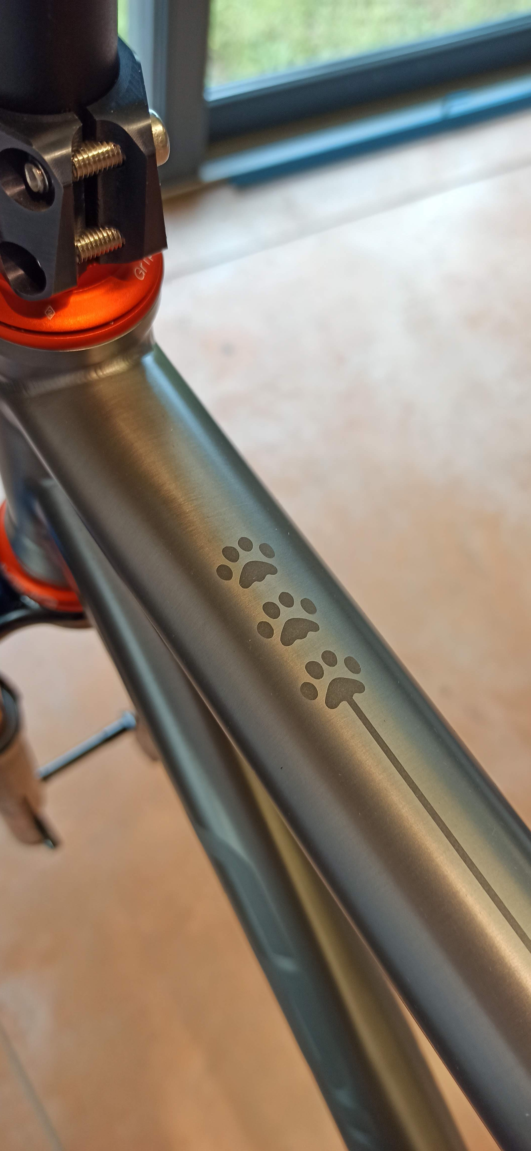
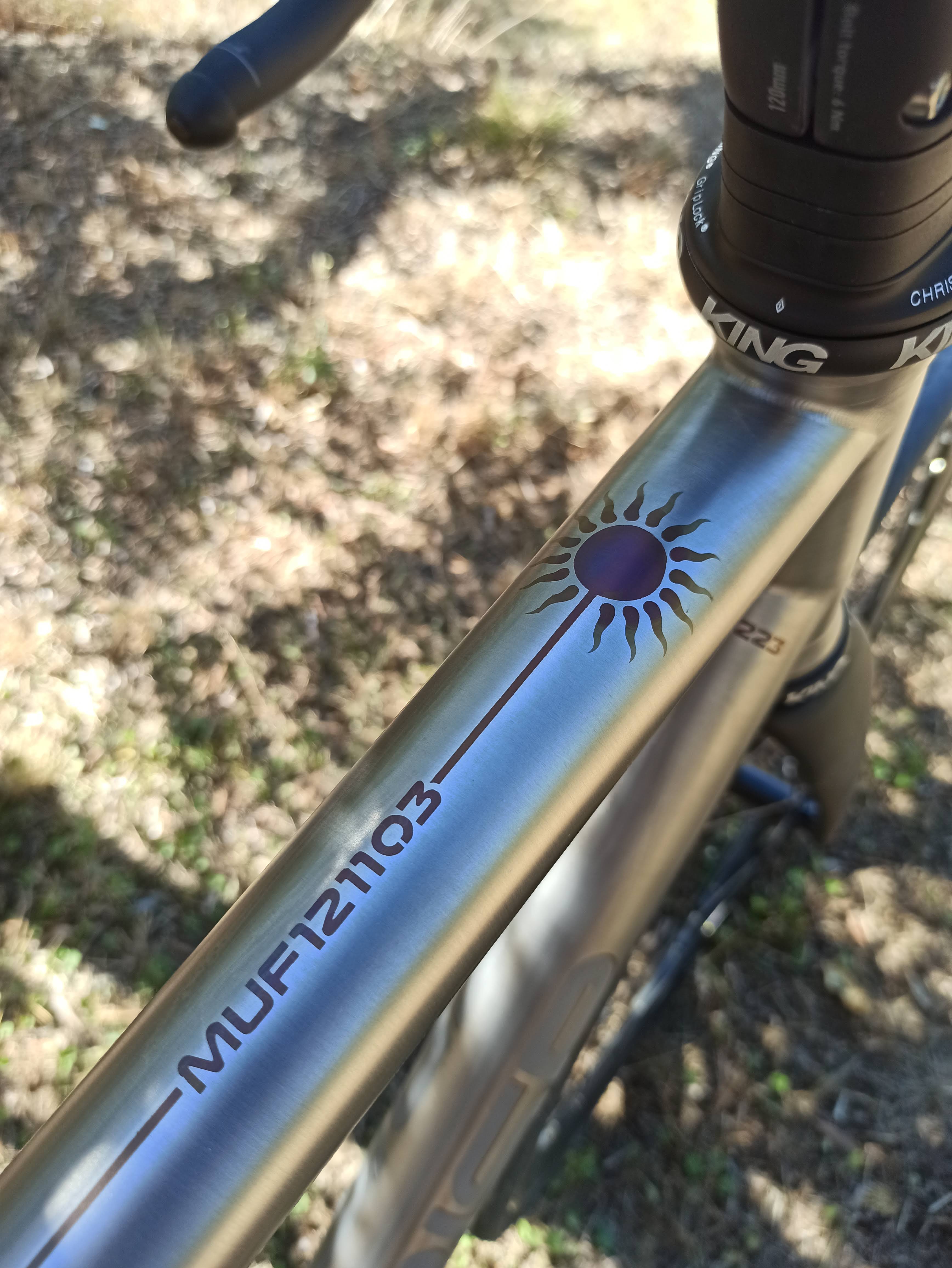


These are just a few that I randomly downloaded just now. The sky is probably the limit, which makes things even more daunting. Here’s something that I like a lot:


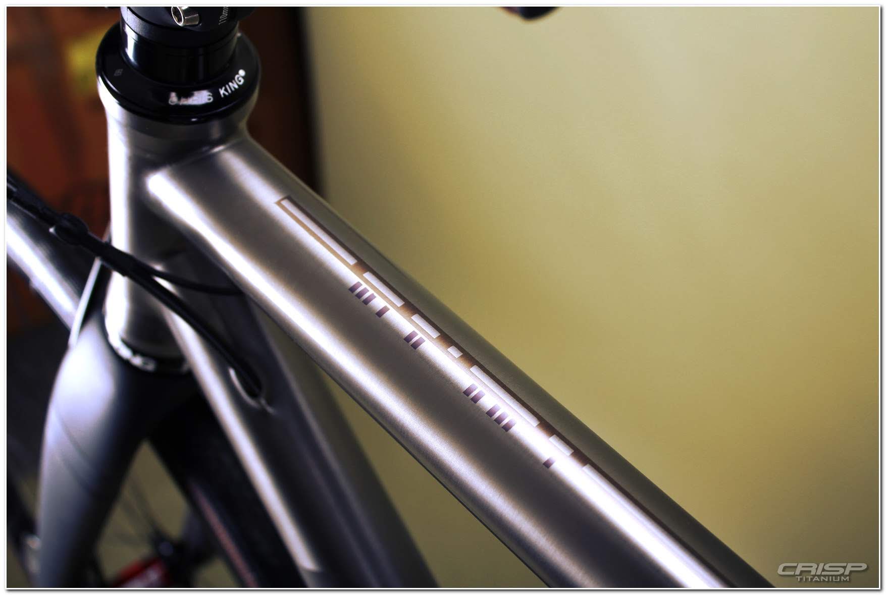
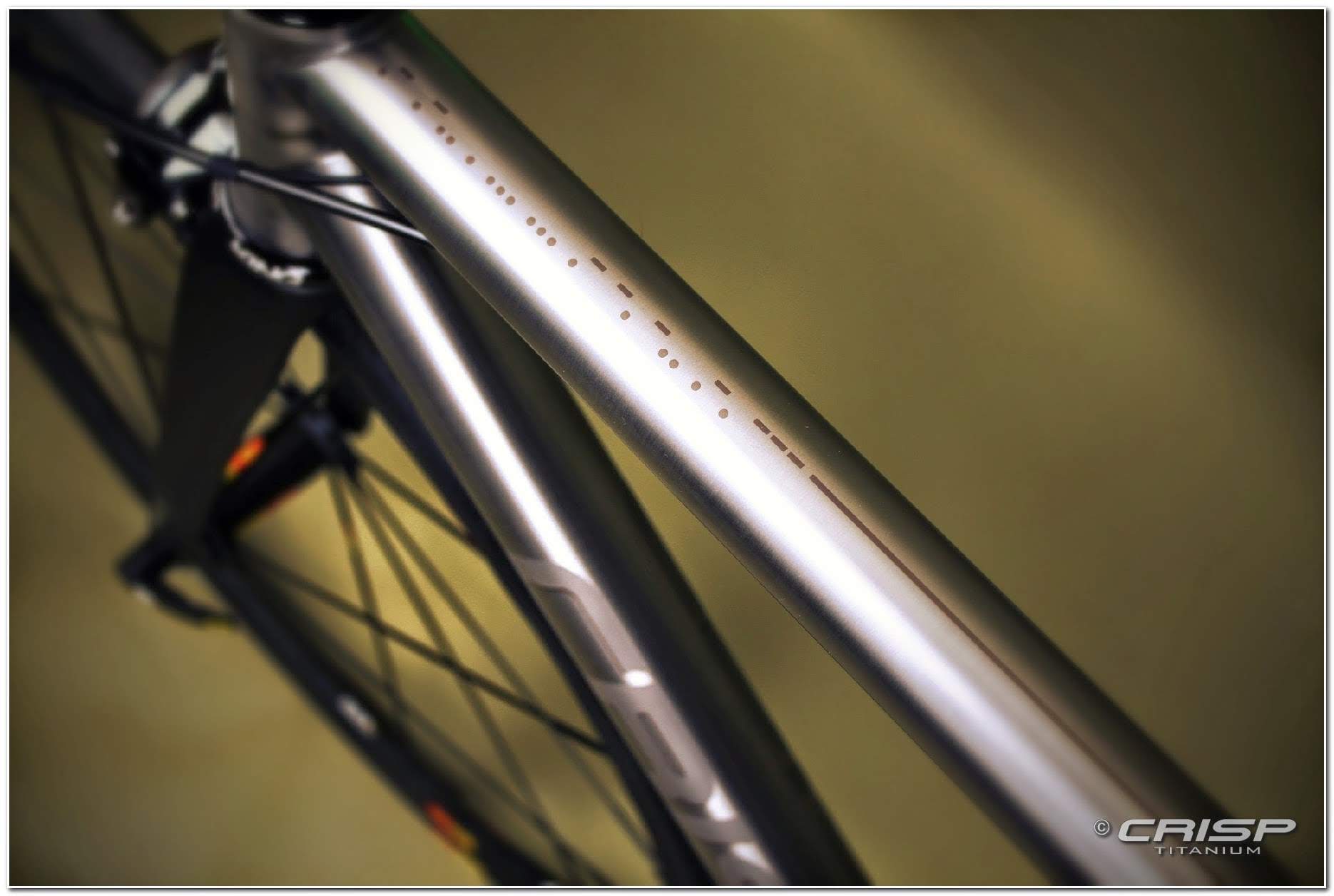

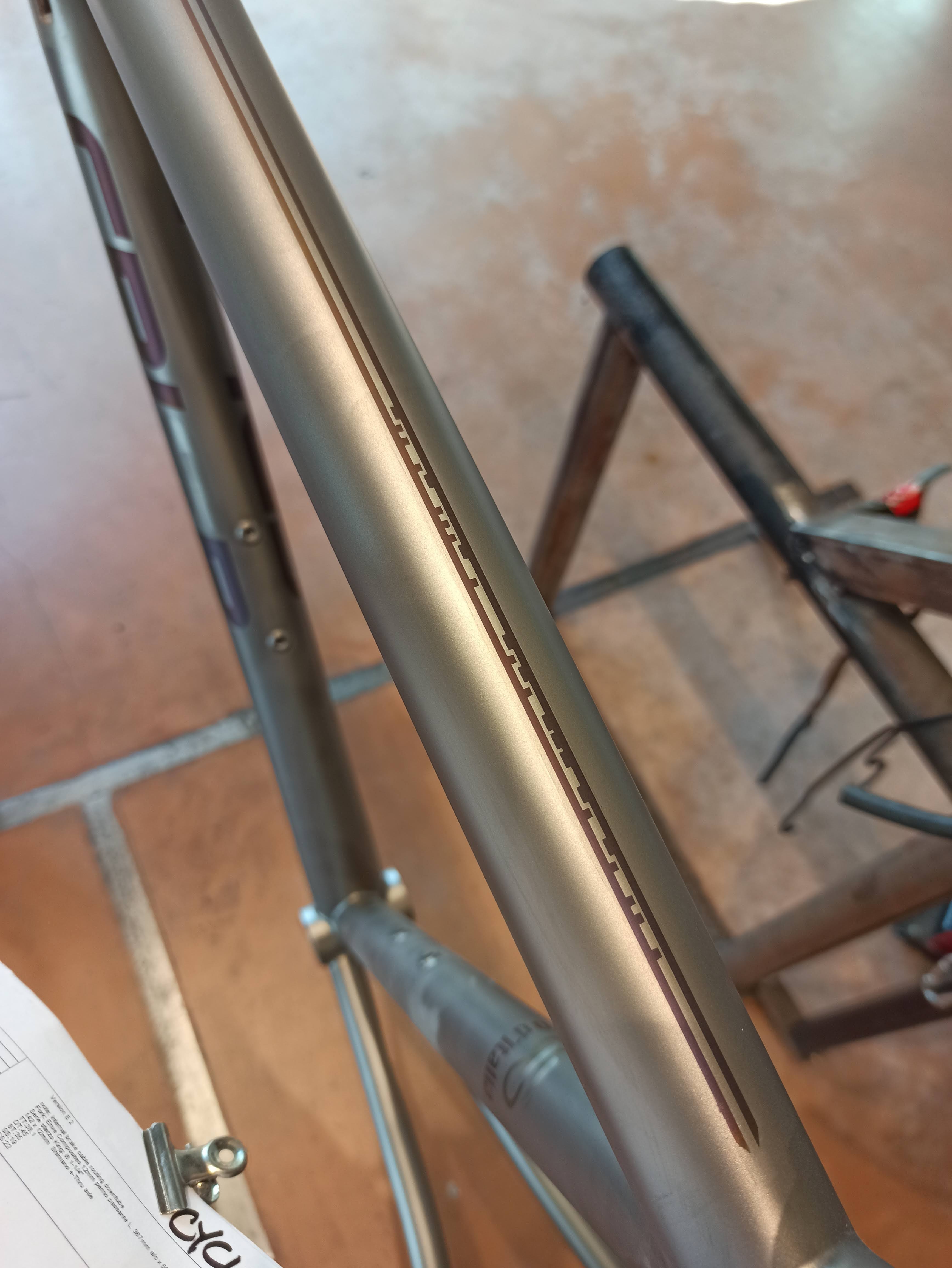
I think these are all Morse Code, or at least stylized versions of it. They are probably all client names, which I kind of like, keeping things discrete. This appears to be a Crisp design specialty.
I have another couple of clin d’oeil ideas that are developing, but I don’t need to rack my brains too hard because there will be some CRISP graphics on the bike already.


That’s going to be a gorgeous bike.
You will still like looking at every day five years from now. For me that would mean graphics that are soothing and intrinsically beautiful over ones that are “interesting” or quirky for quirks’ sake.
Do you WANT a graphic that is going to provoke questions? Will you get tired of answering them, or will you think that’s fun?
And absolutely. Stand by Canada. At this rate it’s going to be hosting me as a refugee.
That second sentence was supposed to have started with “Get something “
All great advice, as usual, Tony. As for Canada, I’ll put a good word in for you. You are lucky that you live so close to the border, too. You are essentially Canucks up there.
Gerry, Patty is the design expert in this household. I tend to share your hesitation on these matters. However, Patty always says “look for what catches your eye and gives you happiness”, or “trust your instinct” That’s why I ended up with $200 sneakers about a week ago. That’s another story. Given your inclination to the Morse Code theme, I’d look to that. It seems very understated and is something you will probably love for a long time. I think it would be fun to spell out “44-5 Cycling” in Morse Code. It’s hidden Easter Egg that will make you and only you know what it means.
Good luck with whatever you decide. Thanks for bringing us all along for the ride.
Eric, tell Patty that is excellent advice! The Morse Code is mysterious enough to intrigue me and I could basically make it say anything I want, as you said!
And I’m looking forward to hearing your sneakers story. Save that one for our next ride.
Hi, i went through this 2 years ago. I guess you have to think about color as well. Anodized Titanium Color Chart – UHD 4K
Your companys colors will be possible.
I would think about a line of your favorit climbe. or Silhouette auf Mont Ventoux
At least a cohearant story is another idea
That’s a handy color chart, thanks! Yeah, I’m probably going to stay subtle and not put too much color on it, but I do like the idea of adding 44|5’s orange and blue someplace, probably very small or hidden.
I thought about an elevation profile of my favorite tour, but an actual route on the road would be a good idea as well. I need to think about this more because I think all this is happening soon.