I’m not really a stats freak, but I can appreciate them, especially when they are made into something accessible, visual, and free. Apparently there is a man in the UK who has plenty of time on his hands (as well as plenty of skill) and he has put together a pretty cool site that links to your Strava account and produces stuff like this: 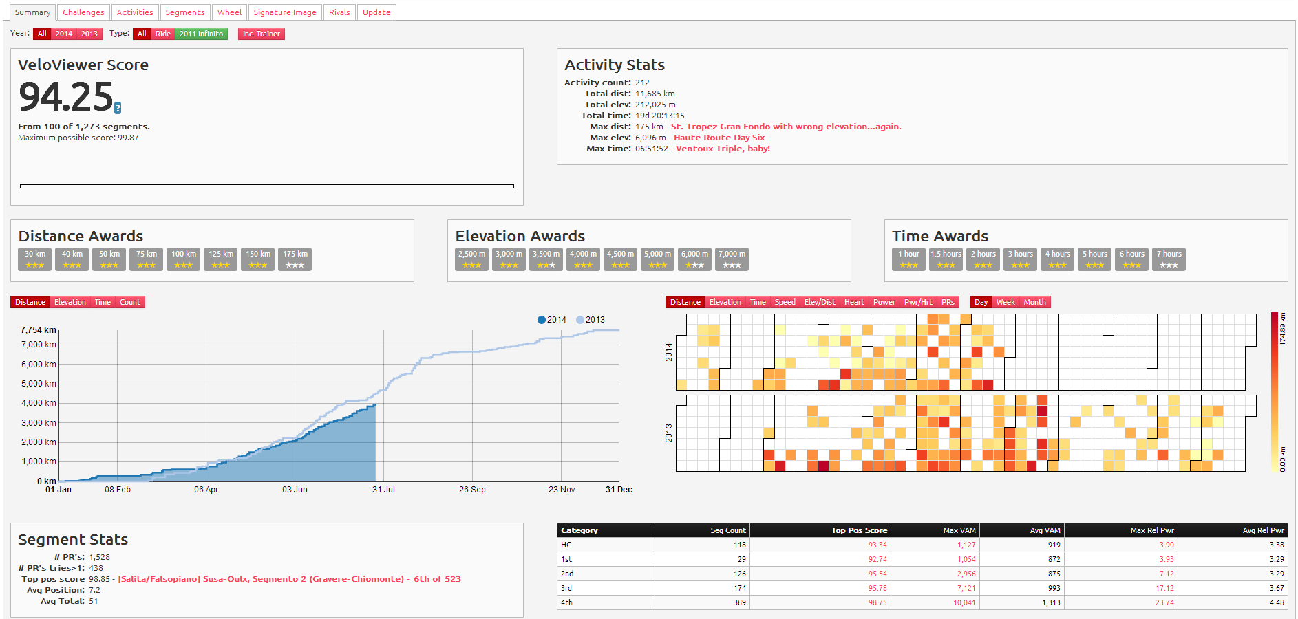 This is the ‘summary’ page, which shows all your activities, a ‘veloviewer score’, which I think tops out at 100 and is a comparison with other users (maybe), ‘segment stats’ (e.g. how many KOMs you busted a lung to get) and a few other things, including a spiffy graph that shows your progression this year compared with last (the blue one on the left). It’s just nice to have all that stuff in one place. But it gets better, and I have Karsten to thank for this find (as well as the site); here is a 3D representation of a ride I did yesterday with John, Pierre and Ginette:
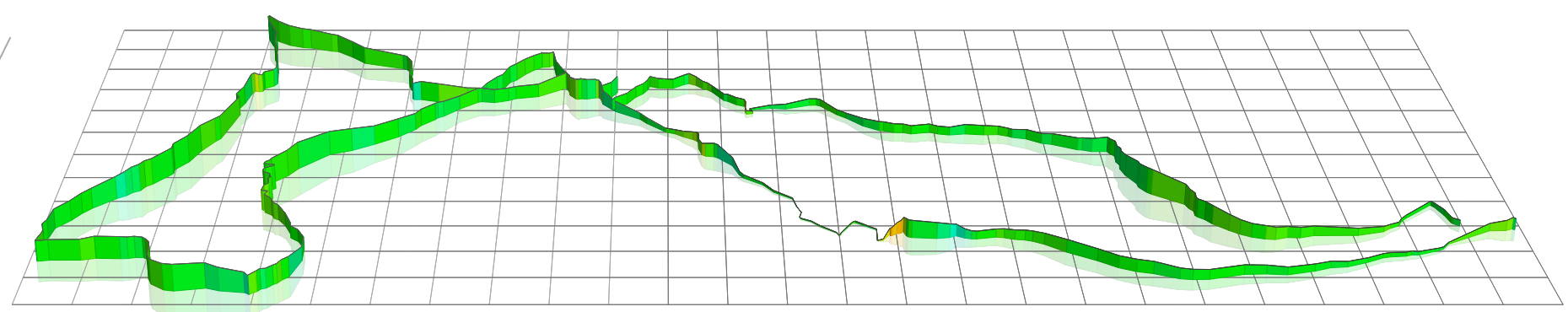
veloviewer.vom
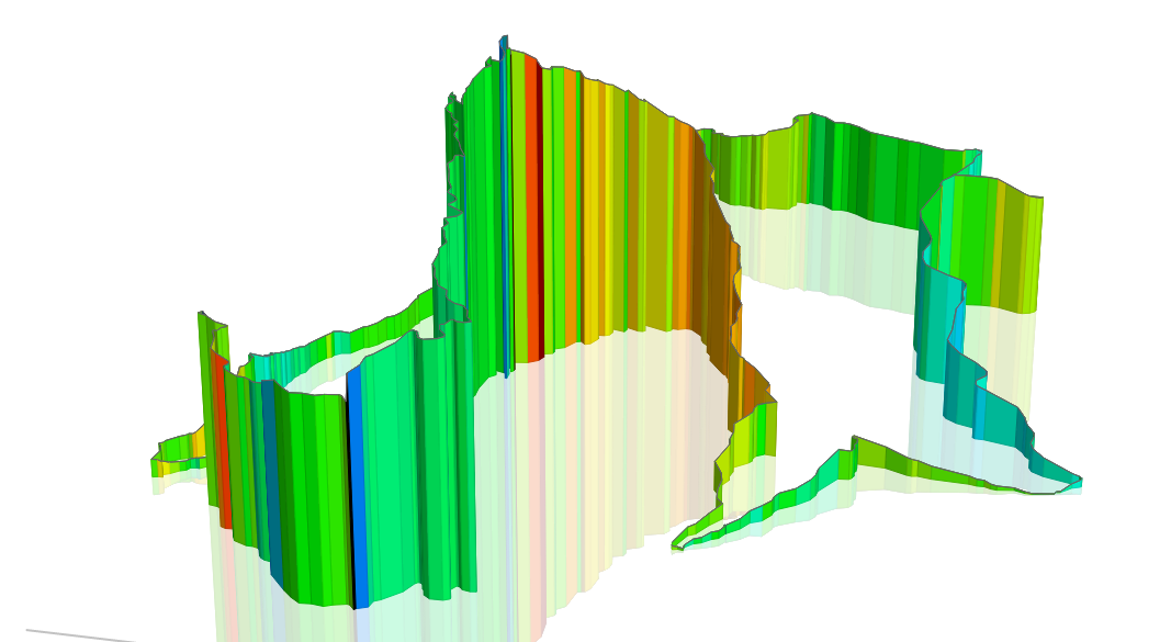
I know, not very hilly. How about the last time I climbed Ventoux, then? Gaining another dimension really gives you a great visual representation of your rides. I’m not convinced it’ll help you in any way, but it works wonders on my brain somehow.
veloviewer.com
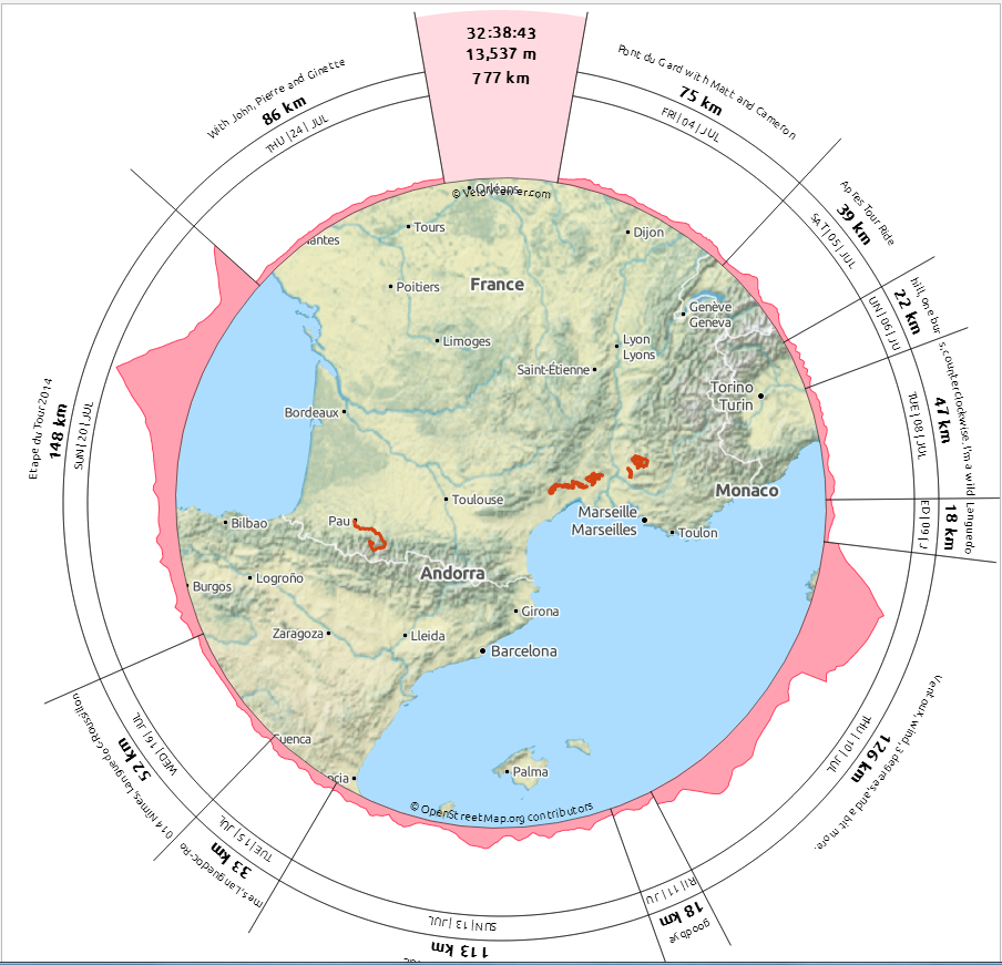
There’s lots more that this guy has produced, but I’ll leave you with one more gem; a ‘wheel graph’ of my rides in July.
veloviewer.com
All this is free, although he does have a ‘donate’ button on the page. Obsessive-compulsives, be warned; this could easily suck you in!

I am glad that you are not a stats freak.
The site looks wonderful but I will stick to my Open Office spreadsheet as its ordinary appearance reflects my ordinary cycling exploits quite well. I do have coloured columns though!
You are cleverer than I am, TP. I can still only do simple arithmetic on Excel..